Search This Blog

Friday, 18 October 2013

Under the Weather

A group project for Pre-Production, we were given the words: Talent show (Britains Got Talent/X Factor) and under the weather (a phrase).

So, we made up a little plot, our main character is in purgatory, the 'tween' of afterlife for the undecided. He's given a leaflet advertising a talent show called 'Under the Weather', and only after showing up does he realise that he will have to perform for his afterlife. He is judged by various gods (including Anubis, 'God' and Buddah) on his 'talents', and after being tormented by various extreme weather (induced by the gods) and the leers of the demonic looking audience, Buddah finally finds him amusing enough to send to his version of heaven.

It'll be a rather abstract piece, with little dialogue. We estimate it will be about 2 minutes long in total (maybe a little less). Heres the animatic I made (storyboard drawn by Beverly) before I handed it off to Char (Charlotte) for final editing and sound.


The feedback so far has been to have our little guy actually do something, like a dance, at the end to win Buddah over (cause getting fried just isn't enough) and to make his reactions to the changes in weather a little more extreme when (if) we actually animate.

Overall, it had a good reception! Also, we had to draw out one of the characters for another pre-production lecture, and I gotta be honest, it's given me ideas, no telling just yet but I may try and make a prequal based on this guy.....


Wednesday, 16 October 2013

Funny in 15 seconds

We were put into groups with other random people and told to make a short animation that'd make you laugh. Its only limitation? The animation has to be 15 seconds long.

Making something funny in 15 secs is hard, as in, painfully hard. You'd think it'd be simple but, well...its not.

In the end as a short the group agreed on making some characters on screen laugh (yes, we borrowed the idea from Despicable Me 2). We were given some feedback and in the end chose to change the idea to an army of something you wouldn't expect to break out into a fit of giggles.

We chose an army of killer robots.

Heres the initial animatic I made. I didn't add any details to the 'robots' at this point as the idea still needed approval and refinement.


I used free soundclips off the internet as well as some sound clips from the minion trailers off Despicable Me to give it the tone the group were after.

Since then, I designed the robots (a mixture of robots from Mass Effect, Portal, and R2D2) to get this:

Then I had to duplicate it onto seperate layers for a close up shot....


And then 25 layers later.... I had an army. I also detatched the heads of the first five layers onto seperate layers to make it easier for another member of our group to animate.


Thats... all I got for now, next step, animating and recording our own vocals.

Monday, 14 October 2013

Comission Number 2: People love the 2nd years...

Got a comission from another second year, Josh, working on his project titled 'My Pet Rock' (its brilliant).

Problem is, I was asked to try and make a car interior. I don't like drawing cars. Or cars interiors. But, I saw this as a chance to try for the sake of practise. And man...was it practise. I cannot replicate Josh's style either, hence why I've stuck with this just being a concept piece.


Personally, I feel rather impressed with the cars dimensions and the interiors perspective, however, my shading and attempt at a more 'soft cartoon' style had taken away from the technical details I spent hours pouring over..... theres a lesson to be learned, stick with what you know when trying new things, then try adding a style. Least I have less hatred for drawing car innards...

Thursday, 10 October 2013

Back in Action!

I'm back! Summer consisted of relocating all my worldly possessions from home to another place. Moving is evil. And tedious, and mind numbing... did I mention evil?

Anyway, term is in full swing and I've already got myself stuck in. I have a deviantart page up and running (yay) which I'm gonna do my best to keep up to date. It won't have just sketches or animatic shots though, I'll be posting all my other arts and crafts hobby projects up too.

My deviantart account: http://lokiisecretspyrofan.deviantart.com/

SO! Since coming back to uni I've gotten the same cold three times (new record), and made friends with the third years in the same flat. I even made a concept piece for Connor McKee's project pitch 'Worlds Away'.

I started out with some sketches to try and get some variation, so he could pick and choose which sort of thing he preferred most.

Concept 1:

Concept 2:

Concept 3:


Final Concept:


Final Concept on Photoshop (shaded for better foreground/background contrast):


Final Concept art:


The 'brief' was to make a cityscape to contrast with the softer natural forest/jungle scenes, so sharp, jagged points, dark tones and shadows, crowded atmosphere, as well as a more sunset fiery colour pallet. The main focus had to be a landing pad with mutliple exits, so in my piece I had the 'tunnels' and wiring beneath the landing pad lit up to draw the viewers eye to that section of the screen, while leaving enough space to fit in what I feel is a real cityscape skyline to contrast with the yellowish sky. I tried to make it seem like the main points of the city were built into immense industrial chimneys, with accomodations and other buldings built into the sides.

Overall I was extremely happy with the shapes, tone and overall atmosphere I achieved with this piece.

Thursday, 30 May 2013

IT IS DONE! Group 5/Team Beeble Sea Stories Animation

Here it is! At long long last, I present Group 5's (aka Team Beebles) Sea Stories group project animation. There may be a few tweaks to the final official hand in film, but this is essentially it!


Our roles:

Me (Katie/Lokii) : Director, 2D animator and animatic designer.
Summary: Made sure everyone was happy with their jobs and workload, made sure they all communicated with each other, animated the first couple of scenes for the flashback sequence (up to the sinking scene, that was Beverly's awesomeness), and made the groups animatics.

Charlotte Grant (Char): 2D head animator. Lord of the lip sync, innovator of interviews.
Summary: The fabulous Char took on the truly epic challenge of animating the interview scenes, mainly by using the symbols created by Beverly. All the movements and lip sync (as well as the cat) was thanks to our Char.

Georgi Urumov (Georgi): Background designer, 3D animator, Music director and Head editor.
Summary: Our very own Master of Maya, Georgi made all our 3D backgrounds and environments, created his very own 3D wave rig specifically for this project,
animated said 3D objects (wrecking ball/crane, and waves), made a unique music track for the animation, and finally, put everything together using after effects. He is an awesome, awesome guy.

Beverly Charoensap (Phanutchanat/Beverbee): Head of Character Design, Storyboard artist and 2D animator.
Summary: The highly skilled Beverly made our initial character designs, and helped us all refine it further for the final animation, she also took the final storyboard plan and drew it up properly for use in the animatic. She also animated the key most dramatic scene in the animation, the sinking scene.


 Overall experience:

In this project, I sort of ended up taking on the role of director early on. When the other totally, totally awesome members of my group gave suggestions about ideas, or explained what they felt should be done, there was always this sort of silence...and I ended up being the first to speak after the awkward silence. When it came to meeting up, usually it'd be Georgi who'd request a meeting, then I'd contact the others and arrange a date and place for everyone to meet. All in all, my OCD tendancies came in handy. Usually I'd write down what we planned to do, and assign the tasks to the people who either wanted certain scenes or tasks, or were the best for the job.

It unnerved me at first, and I still feel almost guilty for essentially saying 'I am in charge', but the thing was, it was a complete team effort. All I essentially did was keep them contained in a space as they spouted wisdom, and tested ideas or designs on my friends and relatives (namely the 'how to kill Andy at the end' scene) to make sure our ideas and jokes were understood by people who hadn't spent months pouring over every single detail of the plot.

We worked together really well as a group primarily (I feel) because we tended to specialise in certain areas. Beverly liked the idea of character design and storyboarding, which I admit I did want to have a go at, but because I know Beverlys style would be much better than my own I didn't argue, and instead asked if I could then have the job of adapting the storyboard and collective work into an animatic. Both of us were happy as a result.

Char was easily the best at lip sync, and with her intense attention to detail and body language we were more than happy for her to 'claim' the interview scenes. I know she spent many sleepless caffeine fueled nights studying the movements and gestures as well as painstakingly adjusting the mouth movements to fit the audio track. And Georgi, our Master of Maya, I felt guilty for letting him take on so much, but he announced from the start that he wanted to take on those roles, and demonstrated he had the knowledge and skill to pull it off. It didn't stop me checking on him via facebook practically every single day to make sure he was handling the workload, but it was enough to make the rest of us take a step back, hand over our trust and let him work his magic.

Our DVD cover: with original artwork by Beverly

We worked so well as a group, and I think this is because right from the start, we kept the communication flowing, we made our own facebook group to keep in touch so we could upload our work and have the others evaluate it in the early stages. And for the plot, I told everyone to go home, and draw up their own storyboards (each frame on one small piece of paper) to bring to our first official group meeting. We taped each storyboard on the walls beneath the stairs by the bean bags (was masking tape, no damage to the walls), and pick and chose the best bits from each storyboard and arranged them into a final storyboard that we all liked.

This meant from the offset that we were all happy with the sequence, even though since then it has been heavily edited and altered to better suit the mood of the final animation. Because we all contributed, we were all more familiar with the overall story, this meant there was hardly and issues when it came to creating the various characters, backgrounds and styles.

Because we all had the same vision in mind, I was more than happy to trust the others to do their tasks without any misunderstandings, this meant we made great time on our initial animatic, plot and overall designs. It also gave us a lot more time to work out the tricky details that developed later on, such as the difference between mine, Beverly, and Char's drawing styles in Flash (resolved by the three of us sitting down in a sort of round robin of sketching, drawing the same character based on the previous persons drawing until all our sketches began looking the same). Or in Georgi's case, the time to learn how to construct the wave rig he wanted and how to edit it in a way so that it fitted with our 2D characters.

To conclude: We had many a sleepless night, we have become nocturnal, human hibernation is looking to be possible, but we DID IT! I'm so proud of these guys, we've all come together to make something epic. Not only have I learned how to use Flash and Premier better, but also how to work with other like-minded people for the same goal, while having fun. I don't see my group as work associates, they really are proper friends that I can have a laugh with and rely on when the going gets tough. I can only hope they felt I supported them as much throughout the project as I feel they supported me, even just by accepting my obsessive need to make notes of just about everything each time someone spoke.

I really enjoyed this project and look forward to hopefully working with them again in the future.

Monday, 27 May 2013

Shell and Paddy comission

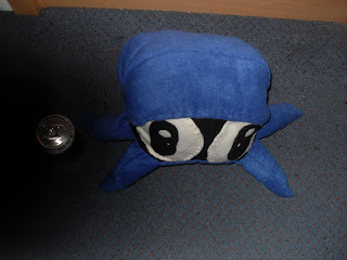
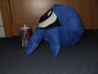
Right, handed in a load of things for last fridays deadline then volunteered to take on a small project on the side. Thomas Spettel, one of the creators of the cartoon 'Shell and Paddy', wanted to comission someone to make a life sized plushie of the character Shell.

I was sent a character turnaround sheet (showing Shell in various stages of rotation) which allowed me to plan out where to start, as well as the rough size of the plushie.

I made a rough template of the fleece parts out of sticky notes, to see what would work best to avoid wasting fleece fabric. Once my sticky note Shell was working, I began cutting out the bits of fabric, making sure to double stitch each seam (haven't got a sewing machine with me on campus) to make sure its secure. I then basically proceeded like that, starting with the body, then face, then legs. Once that was done, I took some photos to send to Thomas to see if he wanted anything tweaked before I finished Shell up and stuffed him.

Once I'd finished making the adjustments (adding extra eye highlights and blunting his leg tips a little), I then stuffed Shell, using the stuffing in the cheap ASDA own brand pillows which is less expensive than buying stuffing on its own, yet just as effective.
I then took these pictures next to a diet coke can, to give whoevers looking an idea of the Shell plushies size.


The reason I was happy to take on this project so close to deadlines was because I've been a fan of Shell and Paddy for some time. When I came for the interview to try and get into Falmouth University I was lucky enough to talk to Joe and Thomas, and they showed me the animatic for the first Shell and Paddy episode, which was essentially what made me decide that I really wanted to end up at Falmouth Uni.

Recently they released another Shell and Paddy episode, titled 'Bath-Time Troubles. I showed it to my cousins (aged from 12 to 20) via facebook and asked them for feedback. The majority of them believed it was a cartoon episode I'd seen on Cartoon Network, or CBBC, and were shocked when I told them it was made by previous students from Uni.

In particular, Shell's reaction to being caught bathing seemed to be the unanimous favoured moment of the episode, followed closely by Paddy being 'converted' into an inflatable toy. The older relatives (four of which were aged 15-20) stated that these particular moments were popular due to the combination of the characters actions in time with the music and sound effects.

Overall though, they seemed to enjoy the fact it was a 2D cartoon, as opposed to 3D. It seems they were more forgiving of 2D character exaggerations in movements and behaviour than with 3D characters, such as in the cartoon show 'Bernard'. This leads me to believe that the current childrens entertainment channels available on normal digital tv (namely CBBC and CITV) has been over saturated with 3D generated or live action shows, leaving few newer or original 2D cartoons to be developed or shown on the channels. I think the creators of Shell and Paddy could use this to their advantage, as those under 10 would enjoy the slapstick comedy elements of the cartoon, and those in their teens would not only enjoy the plot, but find the actual medium of the show to be nostalgic.

And so you can judge for yourselves, heres the episode of Shell and Paddy itself. Enjoy.
Shell and Paddy: Bath time trouble

Friday, 17 May 2013

Zoo trip

On Thursday, we went on a trip to Newquay zoo (the have lions, but no tigers...nor bears...but they do have fossa!). Heres a video I compiled using some of the movements and behaviours I recorded using my camera, with a few photos thrown in to be safe. I do intend to make some character animations based on this video eventually, but I can guarantee it'll be after my immense deadlines.

The quality isn't that good, and the camera is shaky most times, but it does give the general idea of the animals movement.

Oh, that lions roar at the beginning is mine by the way, managed to catch it on video just after it started. And I managed to get a peacock to flirt with me, but to save you all the embarrassment of listening to me cooing at all the animals and generally keeping up a running commentary, I've put in some music. Aren't I generous? Feel free to use anything for reference, some credit would be nice but I'm not too picky. Enjoy.


Friday, 10 May 2013

Ident Project. Status: Complete

At long last, I have gotten my ident animation to a standard I am happy with.


The small psychotic creature is named Beeble, hes a character I've been working on for quite some time really, initially, he had three legs, then I consulted Derek (one of my lecturers) who advised that it'd be easier in the long run to give Beeble four legs. I have never been more grateful for advice.

I incorporated my experimental project into the ident by using an extract for the background. As the quality of the images for that project weren't very good and rather shaky (I created my own line tester using a cheap digital camera, some wire and my book shelf) I felt that it'd be good to give the full impression of an old film being projected onto canvas.

With this solved, I still had no idea how to incorporate the Falmouth logo, until a friend of mine introduced me to Deadpool comics, and began explaining how the character often broke 'the 4th wall' which made him a lot more entertaining.

This got me thinking about breaking -through- my experimental animation. Flipping through all my doodles, I decided on using Beeble for his first real animation, and went ahead with animating him 'burtsing' through the experimental animation using flash. To try and incorporate the two different styles, I had Beeble attack the dragon as it heads off screen, only for Beeble to fail and fall off.
 
At this point, I had a flashback to Andys' lecture about stretch and squash: exaggerate, you'll be amazed how much you can get away with.
So I properly flattened Beeble as he hits the ground. It definately makes the clip more entertaining.

With the 'entertainment' done, I still needed to incorporate the logo. Black writing on a white background, yet my 'background' was black paper....I needed white. So, I turned to tv and youtube for help. I was inspired by some of the old MTV and Channel 4 Estings idents, where creatures usually dragged the logo into place, or produce the logo from a place. I decided to have Beeble puke up the Falmouth logo, emphasising the splat it made so the logo took centre piece on screen.

I met with Adam Aiken to help evaluate my ident at this point. He gave me the advice on animating the actual logo to make it seem more at 'home' in the monster puke. I went back to Flash, animated the logo and added little 'feeler' tentacle things to the main logo and had them wiggle about. I even added a few microbe looking creatures into the rest of the puke for good measure.

With that done, I proceeded to locate the sounds to go with my ident. I ended up using some free sound clips from FreeSFX and recorded my friend Beverly as the voice of Beeble. I compiled everything together in Adobe Premier and exported it.

While there may be some minor issues with the sounds not quite matching up, and a couple of jerky moments in the animation (particularily when Beebles biting the tail), but from what I've learned, people seem to enjoy watching it two or three times without noticing these tiny flaws, so I think I can announce this project, done!

Monday, 6 May 2013

Interior Background

FINALLY managed to get the interior background done. Well, not as done done as I'd like it done but close enough done to be considered done..... yeah.

Back to sanity, I have scanned in my background sketch for the interior background, which is in fact part of a pan shot, and traced it using a specific paint brush tool (size 3, I kept track of which brush types and sizes this time). I traced each specific 'layer' on an individual layer, such as the foreground, the chair, the desk, and the back wall.


 With the bare bones laid down, I added the wood detail using a different brush (size 1). With that done, I blocked in the colours for each section on their own individual layers (there ended up being about four layers to each of the main background segments), then added shading on yet another layer (to show shadow and light).
 
Wood detail, and colour blocking/blending has begun

Colour blocking and blending done

There was -lots- of 'smudging' involved. Well...Photoshops version of smudging at least. It took a lot of time carefully laying down various colours of similar shades so that they could 'blend' enough to be at least reasonably plausible.

Done!
 Overall, pretty pleased with myself. I made a good effort at the lighting (candles are evil) and the right kind of colours (also, evil). Took far far far longer than I'd expected it to, would take even longer, but other projects to do so, priorities and all that. Still! I'm proud of how it looks!

Tuesday, 30 April 2013

Exterior background progress

I believe I'm pretty much done with the exterior layout and background (finally).

As you can see, I began by scanning in my original background layout, then built up the different layers based on their position in relation to the camera (i.e. back railing on the lower layers and such). Once I had the outlines, I used a finer brush in Photoshop to draw out the details of the wood, giving the deck a more authentic effect. I dabbled in various methods of how to add the shady area's and eventually settled for using a normal brush with black and lowered the opacity levels of the brush strokes to around 7%, allowing me to build up the darker areas.

Monday, 29 April 2013

Walk cycles: FINISHED!

Right, had to make three walk cycles based on several themes, I chose 'late for work run', 'flirty female' and 'macho male'. I decided to make all the characters 'ladybugs', even if one is male and the other more or less genderless. I thought this would help me focus more on the characters movements/actions more than whether they looked right.

Flirty Female:

I know, I know, the legs are virtually independant of the body. I was -trying- to mimic the catwalk strut models use, but I think the timing is off. And because the timing is off, the rest of the bodies match up wasn't as effective as it should have been. However, the one thing I am proud of is the use of heels in this animation, as they definately get across the fact that this character is female, even if the walk lets her down slightly.

Late for work run:

I'm proud of this little guy! First of all cause it's cute, and the general movement was based on the youtube video of a man running across a traffic crossing. I'm please with the little 'lope' it's got going on, and in my defense, all business men/women carry some form of bag/suitcase, so what would a ladybug heading to work carry? .....I like his leaf, nuff said.

I think I went overboard on the flickering of each body part though, particularily the head, I'll need to look into making the movements more fluid in the future, particularily for mostly stationary parts such as the head.

Macho Male:

I'm proud of this guy! He's currently my most perfected walk so far (I think). Hes kind of got a Rambo thing going on, but thats besides the point. I used amatuer footage of sumo wrestlers walking around the fighting ring as well as a clip from the Worlds Strongest Man tv series to look at the speed and leg movements. While the sumo's had the laid back 'strut',. the competitors from the tv series had the clear leg movements. Merging the two, I got this as a result.

The hardest part is/was his arms. Men tend to walk as though they've got a watermelon or a keg under each arm and swing their upper body from side to side, which is why they seem to bob up and down a lot when walking. I tried to translate that into this character, and in all fairness, for a first attempt I think I did pretty well. Again, the legs seem to be relatively independant at times of the body, but for the most part, the only thing I'd critisise myself for would be the lack of 'bobbing'. Given more time, I'd go back and exaggerate his movements more to make him more blatently obvious as a macho male.


In hindsight, if I were to go back and redo each of these animations, I'd exaggerate the movements of all of them to convey their 'personalities' more clearly, so that people would understand what kind of character they are in the first second or so, not the third.

Friday, 26 April 2013

Character Designs for the Group Project: Sea Rescue

One thing we noticed from looking at each others test animations was the significant variations in the character style, even though we were basing our drawings on the same character sketch by our character designer Beverly.

So, Beverly, Char and I (who shall be doing all the 2D animation in the short film) met and we took it in turns to try and draw the character each drawn before us, i.e. Beverly drew the original character, I drew from that design, Char drew from my design and so on until our sketches began to look similar to each other.

Character 1 (above)

Character 2 (above)
By using this as reference, hopefully well be able to animate individual scenes of the sequence without worrying about people noticing the change in character style too much.

Sunday, 21 April 2013

The doodles.

I'm not quite sure what happens, during lectures while the main part of my brain is paying attention, the rest of it seems determined to scrawl as many random things onto my notes as physically possible. Not that I complain, its pretty good inspiration most of the time, and I can safely say I know which notes were taken during which lectures by the doodles that keep the notes company.

Me vs Pacman

It does make me worry about what goes on in this brain of mine, but at least it tends to stick with a theme.

In this one, for some reason I've entered a staring competition with pacman....who's looking really ticked off. No idea what I did to annoy him that much, but seems its come to a standstill.

Tetris Takedown


In this one, I appear to be challenging a tetris block to a sort of kung fu ninja fight. Luckily the tetris block seems somewhat confused and not retaliated. I fear doodle-me is not as skilled as she thinks.
(And below that is a series of small images trying to figure out facial expressions. Even my subconscious gets distracted sometimes.)
Pong takes revenge


 Finally, doodle-me has met her match. Never mess with Pong paddles. They don't take kindly to their games being interrupted......

Now, I don't know how all this quite relates to the lecture on getting into the industry (which I was paying attention to, and frankly, the video interviews we were shown seemed pretty 'happy-go-lucky', and all that was determined was 1/3 of the group wants to do pre-production, 1/3 wants to do post-production, and the last 1/3 has no clue), but it may be my repressed self demanding I go see Wreck-It Ralph.

I didn't. Instead I went and saw the Croods, which is a truly brilliant film. It's not much in the way of a solid three part storyline structure, it does have a structure, but most of it rolls together in a way where you're constantly paying full attention to the screen and is full of emotion. The story seems to centre primarily on the bond between a teenage daughter and in particular, her father. At these points I'll admit I did almost start tearing up, so if you have daddy issues, bring tissues, but it was totally worth watching the whole film from start to finish. I also loved how there was a 2D animation introduction which, well, introduced the main characters and their situation.

Group Project: Animatic

Now that I've finally caught up on the sleep I've lost trying frantically to get the experimental animation done, I remember to put up my groups animatic. Theres a scene that we've been discussing to go in the middle to make it more dramatic, and there'll be a twist at the end, but beyond that, I've taken Beverly's storyboard and done my best to get it moving and in time with the interview soundtrack (which, knowing my luck, will also have to be altered. Again.) My favourite part of the whole animation has to be when the victim leaps out the water and flails, classic slapstick comedy.


Monday, 15 April 2013

Studio Ghibli Season conclusion

Been caught up trying madly to get back on top of my experimental animation that I neglected to finish off my Ghibli posts!

Right, one thing I have noticed in particular over the past few years is that each time the Ghibli season comes on Film 4 (the poor mans Blockbuster's selection on shuffle) more of the Ghibli films are being shown in their English-dubbed versions.

Not that I'm complaining, no subtitles means I can devote more of my brain to the film itself, but even so, I get the feeling that since the release of 'Ponyo', the UK has become a lot more receptive to the studio ghibli collection, to the point where their movies are being shown at prime-time slots rather than in the dead of night after another action-thriller.

Its interesting to see the studio getting the credit it deserves for its brilliant films, although it just goes to show how hard it is for people in the mainstream culture to get exposure to films from other countries (America not included). The painstaking lengths me and my friends went to in order to track own our desired Ghibli collection films all these years, and suddenly, its like they've become available overnight. And slightly more affordable as well.

Perhaps its a knock on effect of our cultures definate tilt towards 3D animation as the main technique for big screen films, the backlash causing everyone to scurry for the best of 2D animation in movie form. You only need to watch a supermarket advert to see just how well Disney 'classics' are doing (I once went in and found them for sale at £15 EACH!).

Either way, I'm just happy to see the Ghibli's back on screen and still going strong. Definately looking forward to the next Film 4 studio Ghibli season.


Tuesday, 9 April 2013

Walk Cycle

This one was a pain to get done. After agonising over how many frames to use for half the walk cycle, I then tried to make the head bob appropriately, then came the body, then the legs (which were at war with each other) then the arms. It seemed that after adding a new limb, I had to go back and redo the last one so it would be synchronised with the newer limb, and so on and so forth.

This person is running about on the balls of their feet, its something I do, but I did exaggerate the angle of the ankle, running about like that for long periods of time at this guys speed...hurts....a lot...so yeah, don't try this at home.

This is as close to finished as I'll let myself go, I know I could spend months working on getting this 'just right' but I have my whole life to agonise over that, for now, its just a matter of pulling out an acceptable attempt that I can use as reference for future attempts.


Tuesday, 26 March 2013

Studio Ghibli season on Film 4


Over the years, movies produced by studio Ghibli continue to keep popping up on Film 4, including films such as Spirited Away, My Neighbour Totoro, Ponyo, Kiki's Delivery Service and many more.

I'm not bashing Ghibli films in any way, lets get that clear. I love the animated films they've produced, the animation is realistic, detailed and captures the 'essence' of the characters, the backgrounds are intricately designed and in many of the films the camera angles and movements are so fluid it could almost have been shot in live action.

Even 'Tales of Earthsea', which didn't exactley have the best of plots (it followed a general storyline, but was full of unneccessary twists that would mislead the audience, and seemed unable to really communicate the characters individual stories to the audience in a way that made you really -like- them) was stunning to look at, and is a film I'd definately recommend for others to see purely so they can better understand what I mean when trying to describe how the other Ghibli movies are so amazing.

Kiki's delivery service: So endearing!
One thing I love about Ghibli films is that regardless of whether they're 'my thing' or not, they still have the ability to make me sit still and actually watch them the entire way through. I'm mostly drawn to fantasy adventure as a genre for my 2D animated films, as I feel the medium really helps to give an idea of the 'world' each storyline is based in, without making you pause and think 'this wouldn't -really- work in the real world'.
To summarise, I feel it helps create the 'suspension of disbelief'. This is what I feel most Ghibli films achieve.

Kiki's Delivery Service is a great movie to relate to, while it seems to primarily be about a young witch establishing herself,  I found myself relating to Kiki on many more levels, the whole witch thing was just a fact to accept the real experience was about this girl setting out into the world by herself and how she learns to become a young woman. She faces hardships yet eventually overcomes them, becoming a stronger, kinder individual.

I'll probably add more to this as the Ghibli season goes on, but I seriously recommend watching the rest of the Ghibli collection, the studio has created an art form that I feel can't be replicated.

Friday, 8 March 2013

I HAVE PERMISSION!

Got in contact with a friend of my sisters who went to my highschool, shes a really good singer, and shes written a few of her own songs that shes put up on her youtube channel here: http://www.youtube.com/watch?v=PZS6L7pTReo&feature=youtu.be

Have a look, its pretty cool. Anyway, shes given me permission to use one of her songs for future showreels!!! Meaning I won't have to fear the dreaded copyright! I like how much more relaxed the songs are, a nice contrast to the last one I chose for my first showreel.

Also, I was inspired to make an animation based on Hollies song, 'Falling'. It must be a sign....


Monday, 4 March 2013

Life Drawing (mega upload)

Ok, heres my fav pieces of life drawing from last semester. I'm proud to say there is a definate improvement over time, though still a pretty long way to go in regards to getting the proportion and perspectives right.

The reason I didn't upload this lot earlier...I was in denial. I'd lost the cable to my camera that I'd been taking the pictures on, and it took this long (and much raiding of my flat) to admit defeat and grab another one off ebay, so here they are:

The earliest pieces-


As you can see, focusing more on curves and definately struggling with the proportions.

The next batch-


Bit more experimental and varied, with focus on proportions and breaking the body down into segments. Also, loved the ink painting, looks very caveman!

Final favourite drawings of 1st semester-


I loved the charicatures!!! Was great fun. Definately wanna do it more. Also! Perspective drawings....with perspective! That aren't horrifically out of proportion (except for the guys foot which I realise in hindsight should be a whole lot bigger)!


Tuesday, 26 February 2013

Surfer arm blur

Practising how to get the appropriate movements of an 'arm blur' for a surfer. Seems the blur is just a tiny part of the equation to make the action 'believable', such as the hair moving, the waves, even the shorts rustling a bit.

Wave/hand/claw experiment/test.

Sorry for the awkward title, but yes, another experiment trying to get the general idea of how to make a hand/claw out of an incoming wave. I'm quite proud of the timing for this, slow at the start for dramatic tension then quickly at the end for realism.


Monday, 25 February 2013

Test animation for group animation

At one point we're planning on having a bunch of surfers in the background surfing past...so while the storyboards being drawn up I decided to give it a go....to explain my 'designs'.... Beverly's storyboard surfer looked a bit like George, and because of that her guy that needs saving looks a lot like Andy, so I decided to try and fit in Kathy and Derek, simply cause I can.... I think I need to sleep more really. Either way, I think the animation itself went pretty well for an original tester.


Wednesday, 20 February 2013

Giving a character emotions

I'm quite proud of this little guy! I think I did pretty well on the timing of the jump, as well as the transition from happy to sad. While cliche, they are some of the two most recognised emotions. So far, this is the longest animation I've ever done, with colour!


Monday, 4 February 2013

Happy bean


This bean was born when I was messing about with ToonBoom storyboard (great programme, though I didn't feel like there was much I could do without a drawing tablet). So I went home, went on Flash, and gave him life. I present a happy bouncing jumping (presumably mexican) bean. This was more a way for me to practise the pros of animating things as symbols.


Monday, 28 January 2013

The rabbit.....are you Polish?

Flash animation at its finest.....and I TRIED to keep the rabbit alive, I really did, but in the end, my evil muse won out. This was my first 2D lip sync attempt, using several different mouths etc to make the mouth roughly fit the soundtrack.


I'M BACK

Sorry for the extended abscence, been working like mad to get everything done for my deadline. Heres something I've pulled together while learning about Flash. Yes, it is a cat throwing up a mouse. I was up early. Feel the randomness....